shifting from blog to wfd
I had a blog. It worked fine. Markdown files, a listing page, some basic date sorting, nothing exciting. Then I saw Oxide's RFD system and something clicked.
I will NOT be updating old posts before this one because I don't hate myself. I'm still trying to learn how to write proper blogs and while they may be good practice, WFD<16 is simply from a different era and I do not want to change that.
why oxide's rfd process matters
Oxide's RFD 1, co-authored by Jessie Frazelle and Bryan Cantrill, opens with a line from Steve Crocker's
IETF RFC 3, a half-page document written in April 1969 that established the cultural DNA of the entire internet:
The content of a note may be any thought, suggestion, etc. related to the software or other aspect of the network. Notes are encouraged to be timely rather than polished. Philosophical positions without examples or other specifics, specific suggestions or implementation techniques without introductory or background explication, and explicit questions without any attempted answers are all acceptable. The minimum length for a note is one sentence.
Crocker was a 25-year-old grad student at UCLA when he wrote that. He later recalled being "mindful that our group was informal, junior and unchartered" and wanting to emphasize that these notes were "the beginning of a dialog and not an assertion of control." He chose the name "Request for Comments" specifically to avoid implying authority.
That philosophy, writing it down even when it's rough and even when you're not sure, is the opposite of how most blogs work. Blogs have this implicit pressure to be finished, polished, authoritative. You write a post, publish it, and it's done. It sits there. You might update it someday but probably won't.
The RFD process embraces the messiness. Ideas start as placeholders in prediscussion, move to discussion when they're ready for feedback, get published when there's consensus, become committed when fully implemented, or get abandoned when they don't pan out. A document can live in any of these states and that's fine. The state is the signal.
What resonated most wasn't the engineering rigor (I'm not designing server hardware), it was the underlying belief: writing things down is how you think. Not after you've thought. During. RFD 1 says it plainly: "Writing down ideas is important: it allows them to be rigorously formulated (even while nascent), candidly discussed and transparently shared." RFC 3 explicitly wants to "promote the exchange and discussion of considerably less than authoritative ideas" and "ease the natural hesitancy to publish something unpolished."
That's what I wanted for my own writing. Not a blog where everything has to be a finished essay. A place where I can put down a half-formed thought about CSS performance, come back three weeks later and add what I learned, and have the metadata tell you exactly where in that lifecycle the piece sits.
The RFD concept didn't start at Oxide. Cantrill created the process at Joyent in 2015, drawing on his experience with Sun Microsystems' PSARC (Platform Software Architecture Review Committee). He described the best part of Sun's process as "the most elemental: it forced things to be written down in a forum reserved for architectural discussions." The
Joyent RFD repo is still public. Oxide's RFD 1 also cites the
Golang proposal process, the
Rust RFC process, and the
Kubernetes enhancement proposals as inspirations.
what wfd takes from oxide (and what it doesn't)
The WFD system borrows the structural ideas:
Oxide RFDs also link as id.rfd.oxide.computer!
- States: each document has a state like
published,discussion, ordraft. Oxide hassix formal states (
prediscussion,ideation,discussion,published,committed,abandoned). I kept it freeform because I'm one person and I don't need governance. - Labels: comma-separated tags in frontmatter. Oxide uses these for their canonical categories (
hardware,software,control-plane,security). Mine are more likemeta,frontend,devops. Smaller scale, same idea. - Updated, not created: only the last-modified date matters. If I come back and rewrite half of WFD 3, the updated timestamp reflects that. The creation date is noise.
- Command palette search: Oxide's
internal RFD site has full-text search powered by Meilisearch, accessible via ⌘K. I built the same pattern, a command palette that searches across titles, labels, states, excerpts, and stripped post content.
What I didn't take:
- The branch-per-RFD workflow: Oxide creates a git branch for each RFD, opens a PR for discussion, and merges when published. That makes sense for a 100+ person engineering org. For a personal site, my documents are just markdown files in a content directory.
- AsciiDoc: Oxide uses AsciiDoc. I stuck with markdown because my entire rendering pipeline is already built around it and I don't hate myself enough to migrate parsers.
- The formality: Oxide's RFDs document architectural decisions, API changes, and company processes. They include sections on economic impact, customer outcomes, and security considerations. My WFDs are about CSS bugs and image carousels. The format fits; the weight doesn't need to.
what actually changed
| Before | After |
|---|---|
/blog route |
/wfd route with permanent redirect |
| Date-based sorting | updated field with time support |
created + lastUpdated fields |
Single updated field |
| No metadata | state and labels in frontmatter |
| Basic list page | Table with [WFD ####] - labels | state | updated |
| Same table on mobile | Card layout on mobile |
| Inline search | Command palette (⌘K) |
| Standard navbar | Custom WFD navbar (opaque, edge-to-edge) |
| No table of contents | Desktop sidebar TOC + mobile bottom sheet |
The frontmatter went from this:
title: "some post"
date: "2025-06-25"
excerpt: "..."
To this:
number: 1
title: "some post"
updated: "2025-06-25T12:00:00"
state: "published"
labels: ["meta", "frontend"]
excerpt: "..."
Every post now has a number, a state, and labels. The created field is gone entirely because I only care about when something was last touched, the same reasoning Oxide applies to their RFDs where the updated timestamp is what matters for understanding currency.
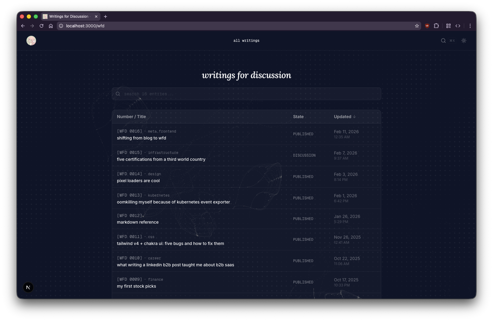
the listing page
after — wfd listing with table, labels, states, and search
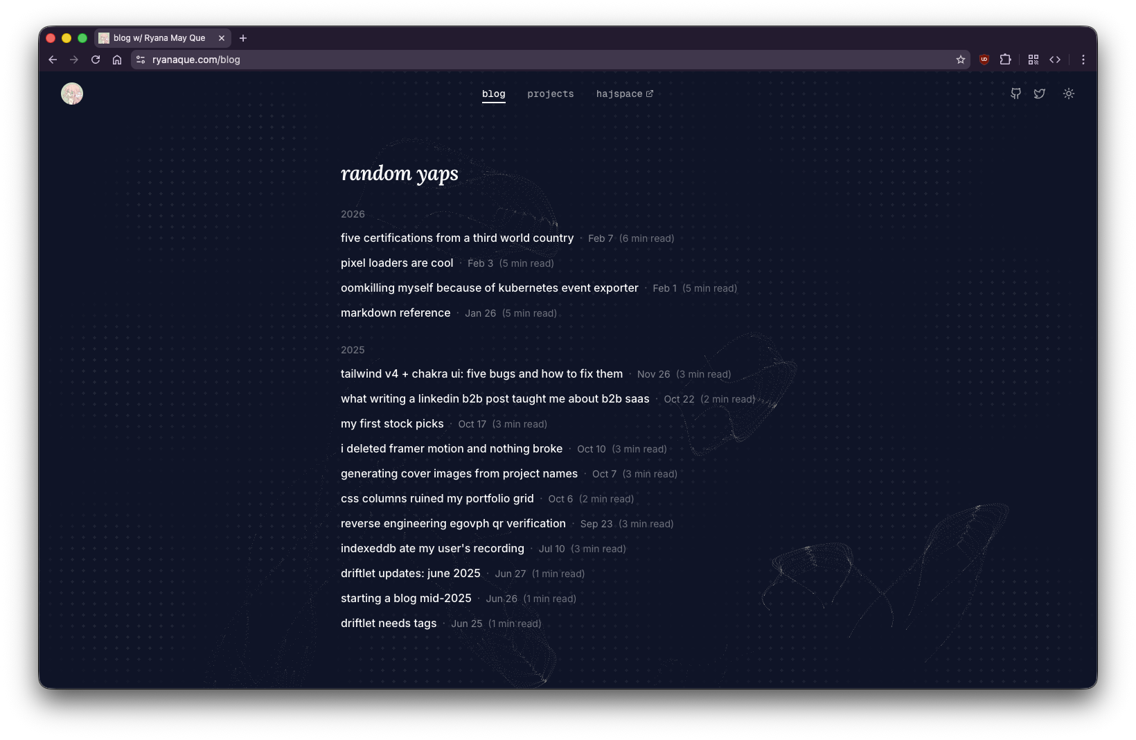
before — the old blog listing page
the post page
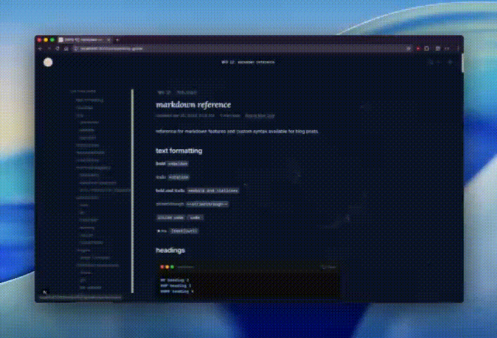
after — wfd post with TOC sidebar, state badge, and labels

before — the old blog post layout

the glassmorphism experiment
The first version of the WFD navbar was a floating pill with backdrop-blur-xl, rounded corners, and a post picker dropdown. It looked cool for about five minutes until I noticed the performance hit.
backdrop-filter: blur() is expensive. Every scroll repaint forces the GPU to re-blur the content behind the navbar. When you stack that with a command palette overlay that also had backdrop-blur-sm, and image carousel buttons with their own blur, the page starts chugging.
The fix was straightforward: remove blur from everything except the navbar, then eventually remove it from the navbar too and just make it opaque. The floating pill design also got scrapped because it was causing content to shift when navigating between the default navbar and the WFD navbar. The final design is edge-to-edge, attached to the top, matching the default navbar's layout exactly. Same justify-between three-column structure, same icon sizes, same padding.
the command palette
The inline search icon in the navbar was fine but I wanted something more like what VS Code or Linear does. So I built a command palette that opens with ⌘K.
It has two sections: navigation (home, all writings, projects, hajspace) and writings (all WFD posts searchable by title, number, excerpt, and stripped markdown content). When you search for something that matches the body of a post, it shows a snippet of the matching text below the title.
The navbar title itself ("all writings" or "WFD 16: shifting from blog to wfd") also opens the palette on click. There's no picker dropdown anymore, just the command palette for everything.
the table of contents saga
Adding a TOC seemed simple. Extract headings during markdown parsing, render them in a sidebar, highlight the current section on scroll. It was not simple.
sticky positioning doesn't work with overflow-x-hidden
The first issue was that the TOC wouldn't stick. It would scroll with the content instead of staying fixed in the viewport. I had position: sticky on the element and top: 28 set correctly, but it just wouldn't stick.
The root cause: the outer content wrapper had overflow-x-hidden on it. I added it months ago to prevent horizontal scrollbar from the full-width image carousel. Turns out overflow: hidden on any ancestor element kills position: sticky because it creates a new scroll container. The sticky element can't escape its overflow container's bounds.
The fix was changing overflow-x-hidden to overflow-x-clip. Both visually clip overflowing content, but clip doesn't create a new scroll container so sticky positioning keeps working.
the IntersectionObserver approach was unreliable
The initial active heading tracker used IntersectionObserver with a root margin that only watched the top 30% of the viewport. This worked sometimes and broke other times. If you scrolled fast enough, a heading would pass through the observation zone between frames and never get detected. The activeId would go stale.
I replaced it with a scroll event listener that iterates through headings in document order on every scroll frame and picks the last heading whose top edge is above 100px from the viewport top. Deterministic, works at any scroll speed, and with { passive: true } there's no performance cost.
centering content with an absolutely-positioned TOC
When the TOC was in the normal flex flow as a sidebar, it pushed the content column to the left. The article text wasn't centered on the page anymore. I moved the TOC to position: absolute so it doesn't affect content flow, but the sticky positioning broke again because the absolute container had no height.
The fix: h-full on the absolute container so it stretches to match its relative parent's height, giving the sticky child room to stick within it.
the image carousel alignment problem
The image carousel is designed to break out of the content column and span the full viewport width, then use a snapOffset to align the first slide with the left edge of the prose content. This worked fine when the content was left-aligned in a flex layout with the TOC.
After centering the content, the carousel's offset calculation broke. It was computing carouselOffset as -bodyWidth/2 (assuming the carousel started at center) and then doing proseRect.left - carouselRect.left for the snap offset. With centered content, these assumptions were wrong.
The fix was simpler than the original: set carouselOffset to -containerRect.left (the container's actual viewport position) and snapOffset directly to proseRect.left. No assumptions about layout structure.
the carousel after fixing alignment and adding directional opacity
This gif is abysmally large. It is 7.6MB and it's going to take a long time to load.
the carousel opacity problem
After fixing alignment, the carousel had another problem: it looked bad when switching between slides. With all slides at full opacity, the inactive ones sitting to the left of the current slide competed for attention. The carousel felt cluttered and you couldn't immediately tell which image was the "current" one.
The fix was fading past slides. Initially I faded all inactive slides to 10%, but that killed the preview effect for upcoming slides. The right behavior was directional: slides to the left (already seen) fade to 15% opacity, while the current slide and everything to the right stay at 100%. This gives a clear "you are here" signal without hiding what's coming next.
fixing what was already broken
The WFD migration exposed rendering issues that had been there all along. Working on the site daily meant actually looking at it, and a lot of what I saw wasn't great.
images were being cropped
The image and gif renderers had a fixed height (h-[250px] on mobile, h-[400px] on desktop) with object-cover. That meant the browser would scale the image to fill the container and chop off whatever didn't fit. For landscape screenshots this was barely noticeable. For portrait or tall images you'd lose the top and bottom entirely. I'd never noticed because the old blog barely had images.
The fix: switch from object-cover to object-contain so the entire image is always visible, replace the fixed height with a max-height (max-h-[400px]), and let the image's natural aspect ratio drive the container size. The container reads naturalWidth and naturalHeight from the loaded image via the onLoad event and sets the correct aspectRatio on the wrapper. No more guessing dimensions from markdown. The browser tells us what the image actually is.
tables looked terrible
The default markdown table styling was bare: no borders, no background, no rounding. Just text floating in rows. With the WFD listing page using a styled table (rounded borders, dark semi-transparent background), the contrast with the inline content tables was jarring.
I added a consistent table style in globals.css: border-collapse: separate with border-radius: 0.75rem, overflow: hidden, and a container using color-mix for borders and background that works across light and dark mode. The last row has no bottom border. The same styling applies to both the WFD listing table and any table inside a post.
admonitions had too much padding and a heavy left border
The old admonition component used a thick border-l-4 with low-opacity backgrounds (/5). It looked like a leftover from a markdown preview theme. The bottom of each admonition had extra whitespace because the last paragraph's margin wasn't being absorbed.
I replaced the left border with a full border rounded-xl at lower opacity (/20), bumped the background opacity from /5 to /10, reduced the bottom padding to pb-3, and added [&>p:last-child]:mb-0 to kill the trailing paragraph margin. They now match the table styling visually: rounded, bordered, subtle background.
the heading jump offset
After adding the fixed navbar, clicking a TOC link would scroll to the heading but the heading would be hidden behind the navbar. Classic fixed-header problem. The fix is scroll-margin-top on the heading elements in CSS:
.prose h1,
.prose h2,
.prose h3,
.prose h4 {
  scroll-margin-top: 6rem;
}
This tells the browser to leave 6rem of clearance above the heading when scrolling to it.
the TOC animation
Each TOC item now has an animated icon that transitions between states. When a heading is inactive, it shows a Dot icon. When it becomes the active section, the dot spin-fades out (rotating -90°) and a ChevronRight spins in (from 90° to 0°), and the text goes bold. Framer Motion's AnimatePresence with mode="wait" handles the crossfade.
on writing things down
There's a quote that Bryan Cantrill carries from Jim Gray, passed through Pat Helland at Gray's memorial service in 2008: "You're not writing enough." Cantrill
wrote about it in his foreword to Writing for Developers: "To write is not just to polish and sharpen our own thinking, but also to collaborate with our fellow practitioners and to bridge to future generations, to share our findings and perspectives so others can benefit from our experience."
In Oxide's podcast episode RFDs: The Backbone of Oxide, Cantrill described the forcing function more directly: "I found many issues in my own stuff, I mean, small issues, but, like, okay. Oh, right. As I'm writing this down, I realized I hadn't quite thought about this." His colleague Robert Mustacchi put it simply: "The act of writing it down just forced you to think about it, a little bit ahead of time."
That's what I've found building WFD. Every one of these posts started as "I should write about that thing I debugged" and turned into a deeper understanding of the problem. WFD 16 itself is proof: I didn't sit down knowing I'd write about overflow-x-clip vs overflow-x-hidden. I sat down to document a migration and discovered that the debugging story was the interesting part.
Cantrill also said something in that episode that stuck: "I want it to be pretty loose. I want to encourage people to write things down more than getting them exactly right." And: "There is going to be a wide variety of quality here. There has to be. There are gonna be RFDs that are extraordinary, and there are many RFDs that are forgettable, and that's okay." That's the permission I needed. Not everything has to be a polished essay. Some things just need to be written down.
The RFD process values longevity too. Documents aren't throwaway. They're updated, iterated on, moved through states. A published RFD can still receive comments and changes. A committed RFD is essentially living documentation of how something works. Oxide's Engineering a Culture blog post lists being "writing intensive" as a core implementation detail of their engineering culture. This is fundamentally different from blog posts, which are frozen in time by convention.
WFD borrows this ethos. When I go back and update WFD 3 because the technique evolved, the updated timestamp reflects that. It's not a correction or a retraction. It's iteration. The document is alive.
what I'd do differently
If I were starting over, I'd skip the glassmorphism phase entirely. Opaque backgrounds are faster, simpler, and don't cause the layered blur performance issues I spent time debugging. The floating pill navbar was also a mistake. Matching the default navbar's layout from the start would have saved the content-shifting headache.
The TOC implementation taught me to check for overflow properties before adding sticky positioning. That's a CSS footgun I'll remember.
current state
The WFD system is stable. All 16 posts are migrated with proper frontmatter. The listing page has a table with sortable columns on desktop and cards on mobile. The command palette searches across titles, labels, states, excerpts, and stripped post content. The TOC sticks, highlights, and animates correctly. The image carousel aligns with centered content.
It's not perfect but it works and it's mine. And if it breaks again, I'll write about it.
references
- Steve Crocker.
RFC 3: Documentation Conventions. April 1969.
- Steve Crocker.
- Bryan Cantrill.
Requests for Discussion. September 2015.
- Jessie Frazelle, Bryan Cantrill.
- Ben Leonard.
- Bryan Cantrill.
- Bryan Cantrill, Adam Leventhal, et al.
RFDs: The Backbone of Oxide. Oxide and Friends, S4 E23. August 2024.
- Bryan Cantrill. Foreword to
Writing for Developers. Manning, 2025.
Joyent RFD Repository. TritonDataCenter (formerly Joyent).